

beeZbee
Rebrand
CBD Kratom | 2023-25
-
beeZbee needed a rebrand that would appeal to a more mature audience while retaining its playful and approachable personality. The previous design was visually chaotic, with too many competing colors. A more streamlined, color-conscious direction was requested, along with a logo update. The brand's wide product range and cannabinoid content added layers of complexity to the redesign.
-
The rebranding process focused on refining the visual system by minimizing the color palette and bringing a cleaner, more organized layout to the forefront. I updated the logo and explored how to balance playfulness with a more elevated, adult look. A major part of the project involved experimenting with flavor-forward labeling—highlighting each product’s unique flavor. This began with limited-edition soda packaging designed specifically for summer, which gave me a fun, seasonal starting point.
-
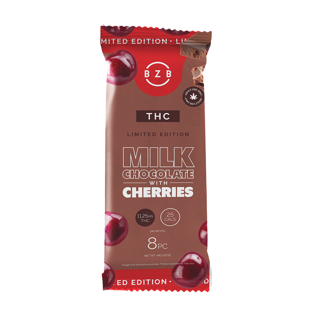
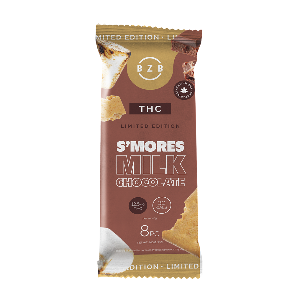
The new design direction brought clarity and impact to the beeZbee brand. Swapping the position of "THC" with the flavor name gave the packaging more presence and personality—something the brand owners loved. The rebrand successfully walks the line between playful and polished, creating a strong visual identity that supports both the brand’s wide product offering and its more sophisticated audience.


The First Version
-
![Design concepts for BeezBee logo, including full logo with primary color, single color version, and secondary color version]()
Logos
Logo is versatile, bold and eye-catching. It can be put on almost any color and still stand out because of its bold font choice and outlined style.
-
![Color palette with hex codes and labels of brand colors, including white, beige, navy blue, dark blue, turquoise, pink, green, and orange, with the title 'Beezbee Brand Colors'.]()
Color Usage
This concept uses colors to distinguish between cannabinoid (like old standards), emphasizes flavor & product type through color, and also uses a strong brand color palette that acts as a pedestal for all the other colors to seamlessly live together, without becoming too much to digest visually.
-
![Comparison of two font styles for the alphabet: on the left, a sans-serif font in uppercase and lowercase with names Brandon Grotesque and on the right, a cursive script font with the phrase Kitten Swash in logo font only.]()
Fonts
Brandon Grotesque is pulled forward from the current branding, and will be the single font for the entire brand.
Kitten swash is to only be used for the logo. -
![Mockup of BeeZ Bee product packaging with multiple flavors including THC+CBD Caramels, Fruit Mix, CBN Lollipops, and Grape Ape. The packaging displays branding, flavor labels, CBD and THC dosage information, and colorful graphics.]()
Edibles Pouches
Brand colors (navy, white & peach) offer a solid standing ground for the other colors to maintain a sense of consistency & balance within the design. It also minimizes the potential rainbow of products as they are all placed together.
Easy to identify between product type (color block at the bottom), flavor (large text) & cannabinoid (pattern color at the top) at a quick glance.
Product type icons will correlate to the product type color, and the cannabinoid color on the tearaway will correlate to the quote color around the bottom hex - establishing the system to consumers.
-
![Packaging design for BeezBee cannabis-infused gummy products, featuring three pouches labeled CBN Lollipops, CBG Gummies, and THC+CBD Caramels, each with colorful geometric patterns and flavor descriptions, displaying THC, CBD, CBN, and CBG content per serving.]()
Edibles Pouches - Flats
-
![Three cans of Beez Bee THC + CBD seltzer in cherry-lime, kiwi-lime, and lemon flavors, with water droplets on the cans.]()
Beverage Cans
In the case of beverages, to offer a variety of colorways, I focused the main color to be “flavor color” (the concern was that the old beverages all appear similar with the white being the main color of all of them)
The background will also receive flavor profile silhouettes, which will remove the pattern the the top and replace it with appealing phrases to steer it more to a mainstream audience & to reduce visual noise. The cannabinoid color now just becomes a solid fill rather than a pattern at the top.
For the “product color” which is normally in the bottom hex shape, this will now become white + 50% tint of the flavor color so we can keep the flavor image container
-
![Two cannabis-infused beverage packages, a kiwi lime seltzer and a cherry lime seltzer, with THC and CBD content, flavor labels, nutritional info, and colorful design elements.]()
Beverage Cans - Flats
-
![Five colorful cartons of Beez Bee tinctures arranged in a row, labeled CBN, THC, CBC, CBG, and CBD, each with a 30ml size and logos indicating adult use and 100mg per serving.]()
Tincture Boxes
In the case of tinctures, where you’re really only buying the pure form of the cannabinoid, using the background color as the cannabinoid color will make it easy to distinguish between each type and match with the other products to add “enhancements” for a boosted experience.
Branding still remains consistent in structure, and leans on the navy & white for brand identification.
Since tinctures only take up a small amount of real estate in the stores, this would not become overwhelming in the store experience.
-
![A digital illustration of a beverage product packaging for Beez Bee CBN+CBD tincture, featuring a blueprint-style design with hexagon and bee symbols, including label details, and a separate royal blue label with product information. The background is light pink with a dark blue banner at the bottom that reads "BEEZBEE PACKAGING".]()
Tincture Box - Flat
-
![Design layout of bee focus product packaging, showing names, logos, and natural ingredients with hexagon pattern and product details for BeeZBee THC tincture.]()
Tincture Box - Flat


The Second Version
-
![Two cans of blueberry flavored THC seltzer with a paw print logo, surrounded by fresh blueberries, against a blue background, with water droplets on the cans.]()
BEVERAGE CANS
This iteration used a limited color palette, and used real images of fruits to depict the flavor.
-
![Green apple flavored THC CBD gummies in a resealable bag with five candies inside. The bag features a white leaf and bee logo, labeled 'THC CBD gummies' and 'green apple flavor.' The back of the packaging displays product facts, ingredients, and warnings.]()
GUMMIES POUCH
Displaying the cannabinoid content prominently alongside the flavor colors gives the audience a clear picture of what the product is at a quick glance.
-
![A resealable bag of THC caramels with the front showing caramel candies and the back displaying product information, ingredients, and nutritional facts.]()
CARAMELS POUCH
Displaying the cannabinoid content prominently alongside the flavor colors gives the audience a clear picture of what the product is at a quick glance.


