Todd Adams
Rebrand
CBD Kratom | 2022
-
Rebrand Todd Adams to better reflect a luxury cannabis brand while shifting focus toward an effect-based product line. The original silver-and-black color scheme felt dated and lacked emotional or functional storytelling. The goal was to elevate the brand visually and conceptually for a more refined consumer audience seeking a premium, purpose-driven experience.
-
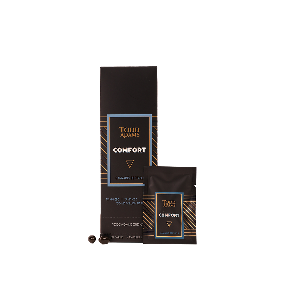
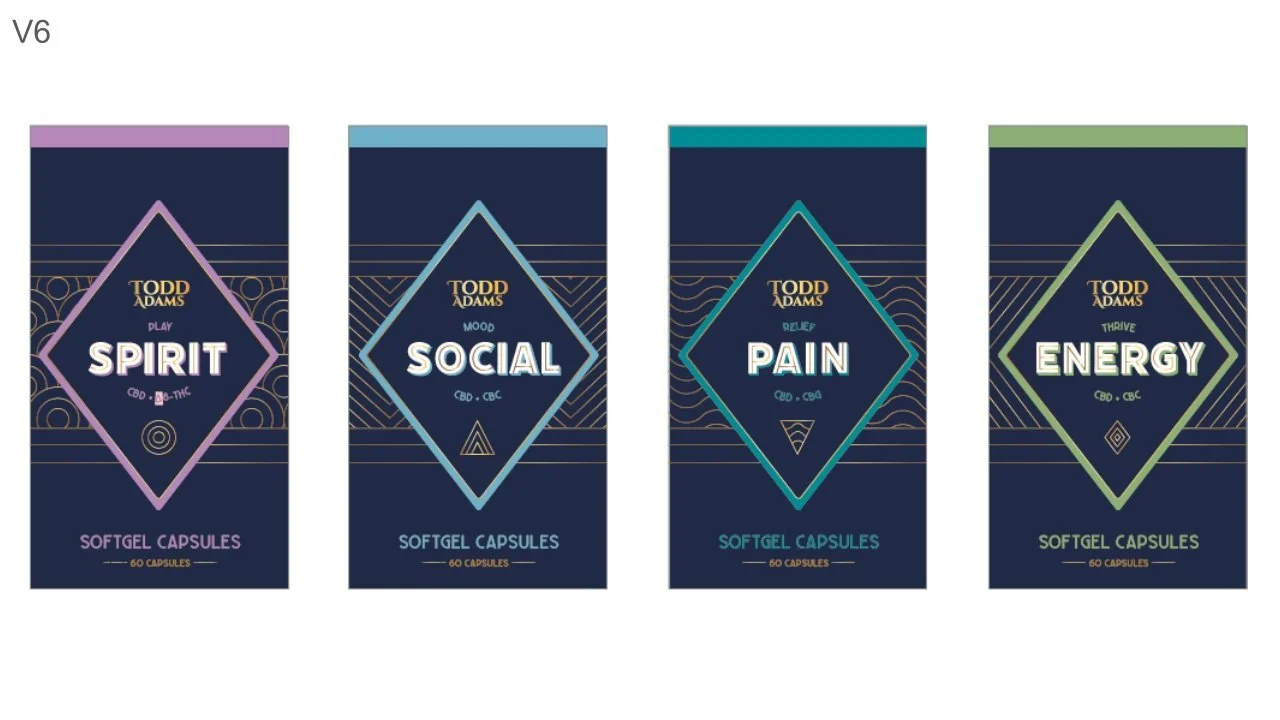
The rebrand began with a transition to a black-and-gold color palette, immediately creating a more upscale, elegant aesthetic. To align the product line with specific outcomes, I built a visual and color-coded system around three pillars: Mind, Body, and Spirit—each representing a different type of product effect. I also created a secondary color palette to ensure easy future expansion.
The first launch under the new brand was a line of “Effects” softgels, packaged in a 30-count sachet tower for convenience and daily use. Design exploration started with intricate Art Deco linework, later evolving into dynamic icons & patterns unique to each effect. As the visual language matured, emphasis shifted from the logo to the product effect, reinforcing the brand's new function-first identity.
-
The final brand system for Todd Adams blends sophistication with clarity. Its gold-accented, effect-driven design creates a strong shelf presence and connects emotionally with consumers based on their needs. The modular pattern system and expanded palette future-proof the brand for continued growth. With its first launch—the “Effects” softgels—the rebrand successfully sets the tone for Todd Adams as a premium, purpose-built cannabis line.
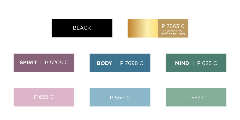
BRAND COLORS